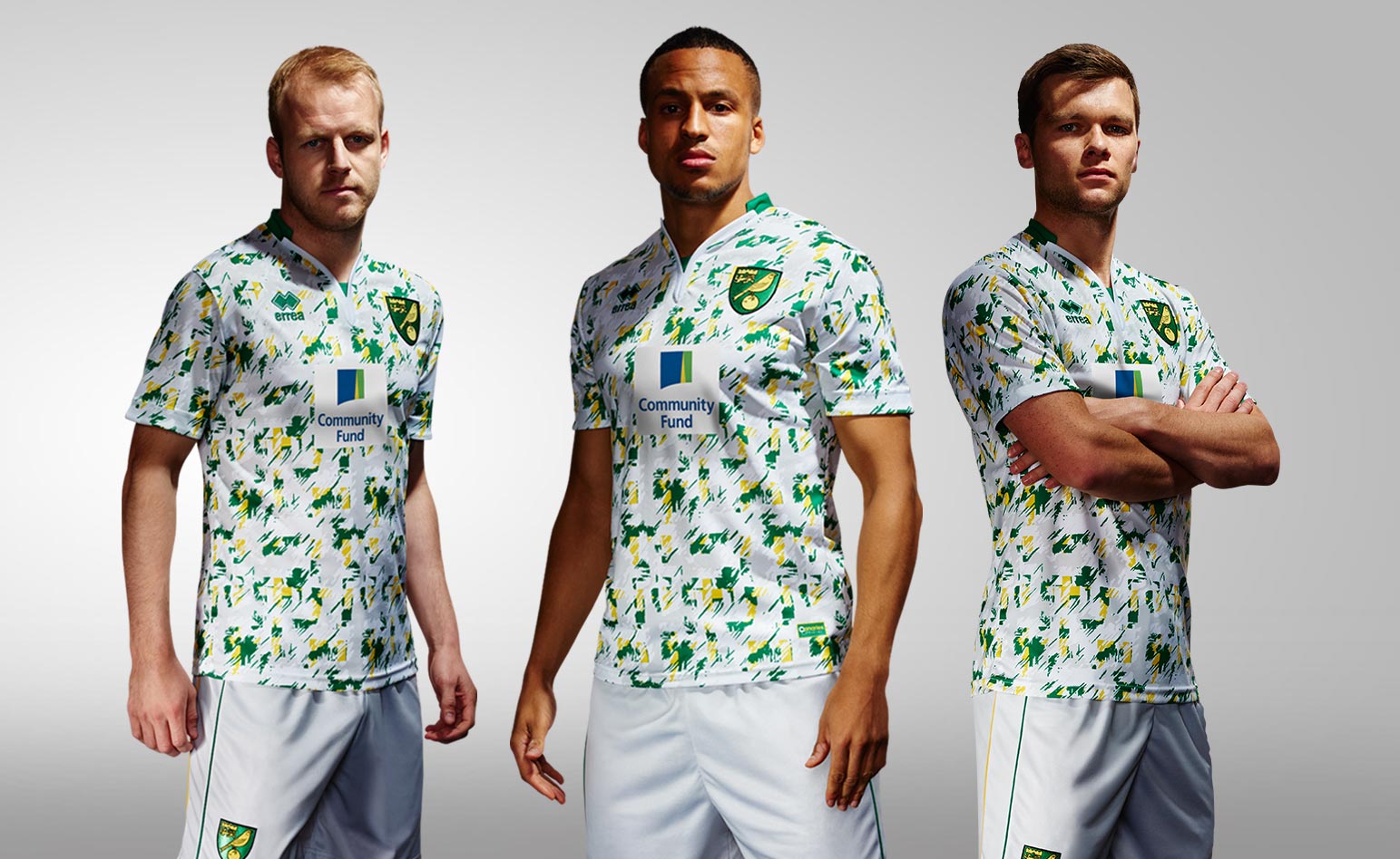
Norwich City 2016/17 Third Kit Revealed
There is a growing trend with third kits for the design leash to be loosened; artistic talents are given free reign. Norwich City‘s third kit for 2016/17 proves this is not always a good idea.
John W Henry wondered what the Arsenal board were smoking during the aborted attempt to take Luis Suarez to the Emirates in 2013; we might ask the same of the Errea design department.
NORWICH CITY 2016/17 THIRD SHIRT
This is the third shirt which Norwich City will wear when their home and away kits can’t overcome a colour clash.
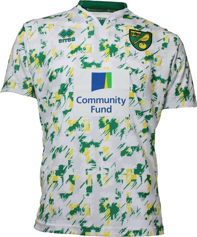
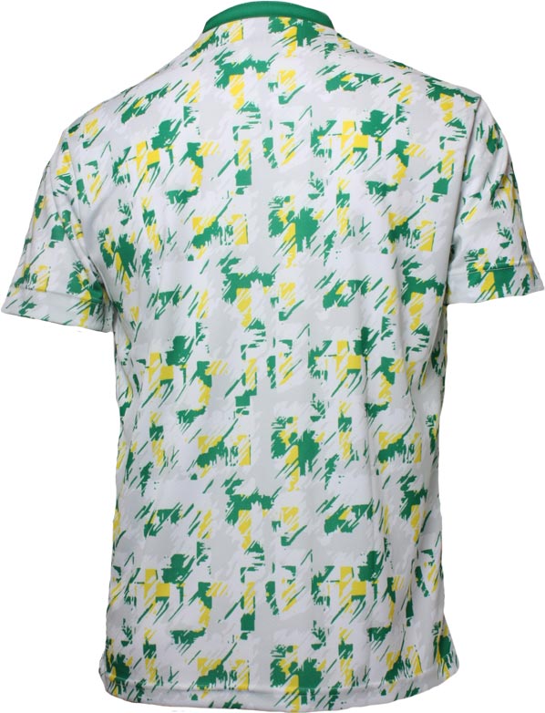
In Errea’s defence, there’s a retro feel to this design. The pattern is reminiscent of the kit the Canaries wore from 1992 to 1994 on the home kit. Glorious times in Norwich City’s history and little wonder with the spectre of a Championship season ahead of them, that they want to remember the good old days.
The trouble is, Norwich were mocked for the design back in the day. This time, the faded brushstroke effect is in yellow and green with the white Y-neck collar the only trim to escape the artistic horror show.
Small mercy for the players in the plain white shorts with green trim down the side of either leg.
If Laura Ashley made football kits…
NORWICH CITY 2016/17 GOALKEEPER THIRD KIT
The goalkeepers doin’t get off lightly either.
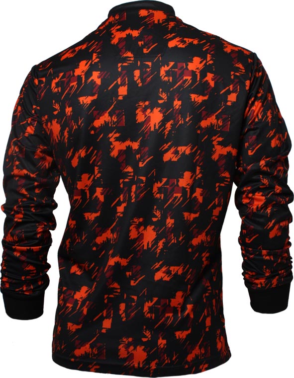
Actually, it’s a lot worse.
It’s a frankly horrific colour combination. Brightly contrasting, there is no argument about that but the orange pattern is an awful mistake to have made.
There may be method in the madness with the possibility of opposing forwards vision being blurred as the goalkeepers rush out to confront them.