This Barcelona Concept Kit Features Their Re-designed Logo.
Does the New Logo Suit the Latest Barcelona Concept Kit? We Think So.
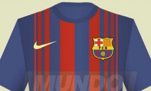
Are you enjoying the international break? That’s the question that we’ve heard a number of times these past few days. UEFA has tried to spice up international friendlies by turning them into a competition. UEFA Nations League adds a competitive edge that the friendlies were completely lacking. Last night, England beat Spain 3-2. It was an excellent match. Furthermore, Spain looked like they might steal the draw if there was just a few minutes more. Now, until November, we’re back to league football, whether that’s Premier or Championship. So our collective attention turns towards the top teams. In Spain, one of those top teams is Barcelona. Here is the 2019/20 Barcelona concept kit.
The colouring on the jersey remains the same: red and blue. The colours appear on the half-and-half front. A physical pattern runs horizontally across this colour division. Furthermore the sleeves on the Barcelona concept kit are also half-and-half. They’re divided by Nike’s digital pattern, which adds depth and
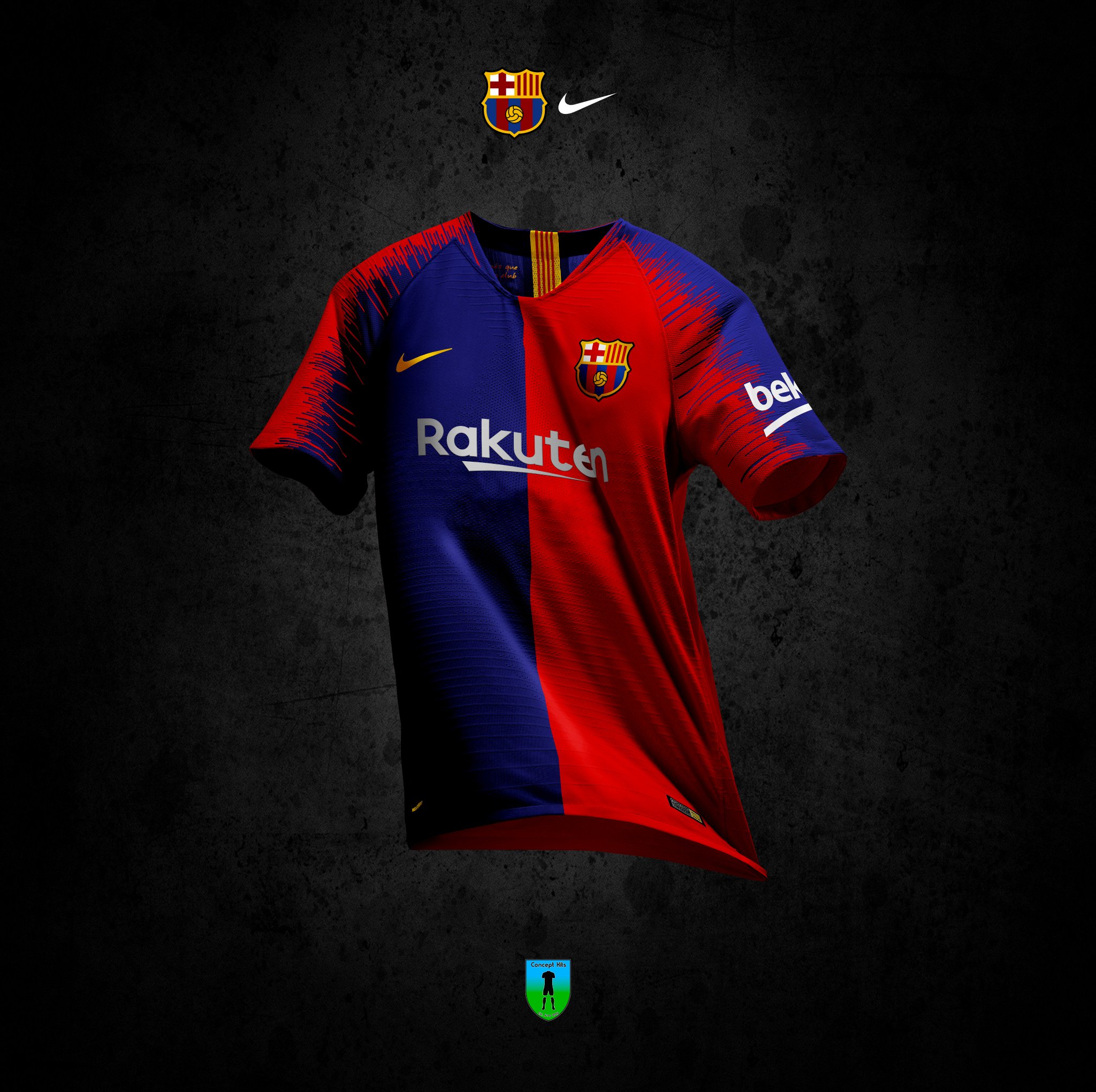
While the colouring is rich, the badge has been the most controversial element. For the first time in 16 years, it has been updated. Not too drastically, but an update all the same. The letters ‘FCB’ have disappeared, the ball is more defined and the two flags above have lost their bordering.
We at UK Soccer Shop think this Barcelona concept kit is excellent. One fan on Twitter noted that it’s ‘The best one since the 90’s era.’ Another wordsmith said, ‘That’s sick. Nice job.’
Concept kits are usually a shot in the dark. They’re an educated guess on what a future kit might look like. Usually they don’t materialise as anything more than fan fiction, but who knows, maybe we will see this Barcelona concept kit next season.