Canada’s 2018/19 Home Kit from Umbro Revealed
Oh Canada. Those are the only two words this author knows from the Canadian national anthem. Is it even the official national anthem? We’re not fully sure. All we know is that they’ve just released their 2018/19 home kit and it is lovely. The theme of the kit is naturally maple leaves and while they are leaf-ing their kit tops at home, we really think these jerseys are special. While the country is currently ranked 80th in the world, maybe this time next world cup we’ll be saying ahoy to our Canadian cousins.
The kit itself is red. Like many kits that isn’t particularly exciting, however the finer touches do make it a kit worthy of competing on the world stage.
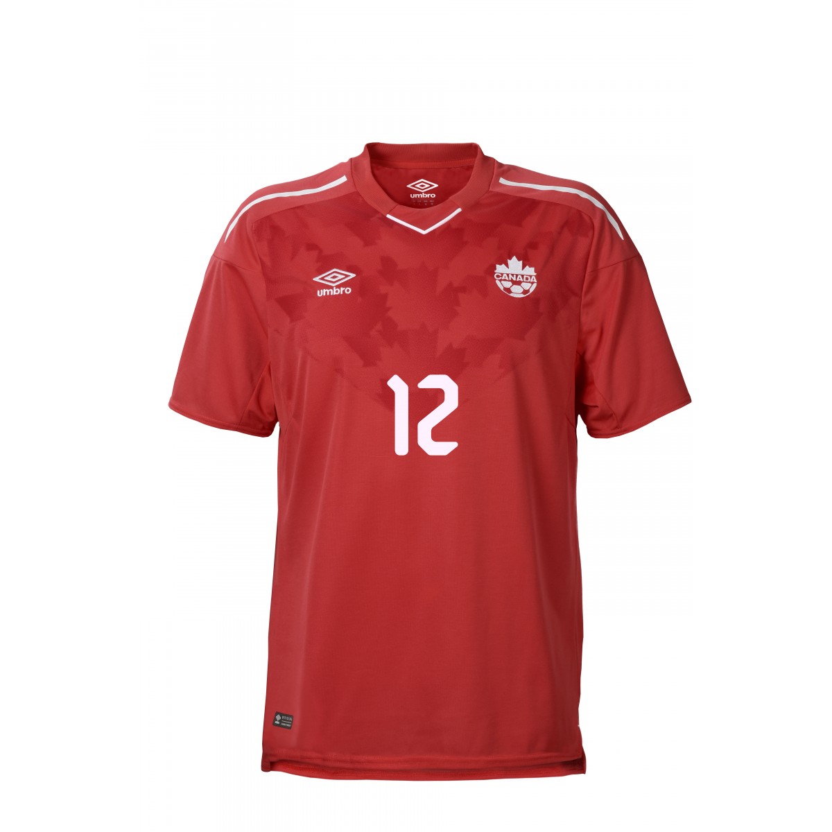

From the centre of the chest, out of the player’s number springs forth darker shaded maple leaves, rising out towards the shoulders like a sort of Canadian Pandora’s box. The leaf pattern is subtle enough not to overcrowd the Canadian crest, nor Umbro’s logo. The pattern gives the kit top a nice shape and welcome dynamics.
At the front of the neck is a white line which angles the collar. It adds to the lines on the kit top and matches the white lines which are across the shoulders also add the the dynamics of the kit.
On the nape of the jersey is the Canadian flag. Sitting proud and true. The Danish decided to commemorate their military, the Canadians – their country’s flag.
The font of the kit top might be the only part which doesn’t fully make sense. The font appears like a 90s video game and while bold, it doesn’t quite match the understated nature of the logos and finer details.
We’re gutted that Canada won’t be competing in Russia 2018, but one thing’s for certain: we’ll be eagerly watching their friendlies, hoping to showcase their 2022 world cup kits.