See Our Stunning Collection of USA Kits
The land of the free and the home of the brave bring a lot to the kit design table. Their stars and stripes, together with red, white, and blue mean that bold, stunning kit is never too far away. We’d like to talk you through some of our store highlights, all of which are currently discounted (as of 02/05/2018). While they didn’t qualify for this year’s World Cup in Russia, there is no better time to invest in some excellent sportswear.
2018-19 USA Away Concept Football Shirt
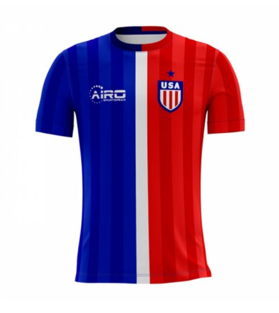
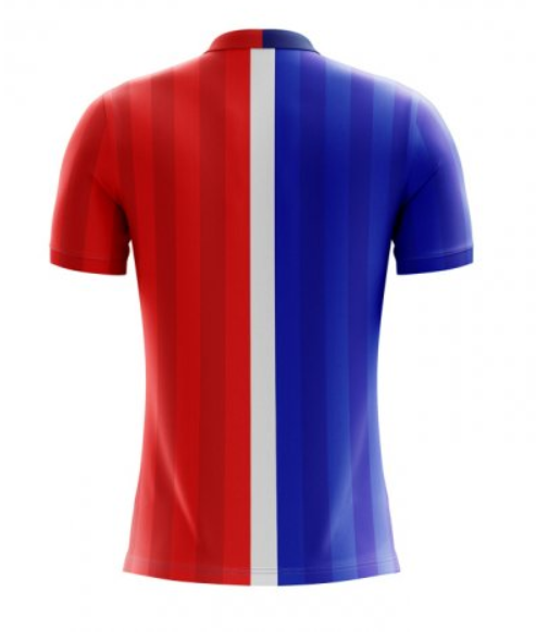
The only stars this kit needs is the one sitting above the country’s crest. We like the dividing white line down the middle but only because there are further lines which bleed into the blue and red sides. The kit top is striking in its simplicity but stylishly colourful. It is interesting that Airo decided not to have any red in the blue zone or vice versa. This is a stunning kit, simply because of its bright colouring.
2018-19 USA Home Concept Shirt
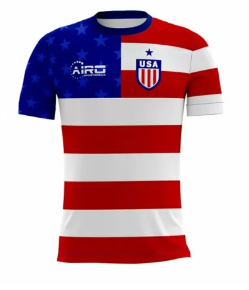
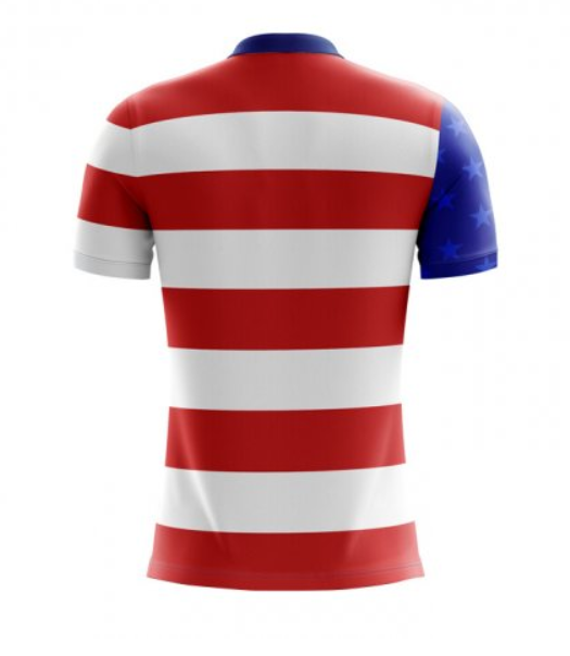
This is the kit which has most tempted the author over the past week. The kit is so much like the flag that you might as well be wearing it. The right angle across the stripes on the chest are always a winning idea and Airo have used this space to showcase themselves. The sleeves are a nice idea, having the blue bleed over onto the back and the collar being blue gives a great effect from the back.
But we don’t just have to look longingly at concept kits, Nike have recently unveiled the team’s home and away kits to be used for real:
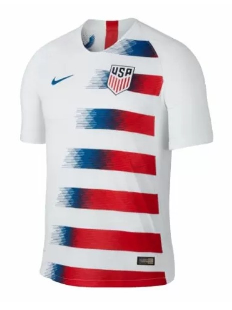
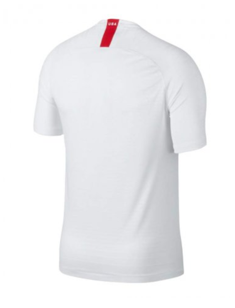
The top certainly does have stripes, fading into the white and back into a solid red, which matches the line up towards the nape. It’s quite a simple concept and the digital, pixilated graphic going into the white seems to be a popular design style for many kits this year. Here at UK Soccer Shop we’re a sucker for a blank back and this one’s only distinguishing features are the nape, as mentioned, and the sleeves which are separated by a physical white line.
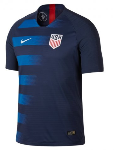
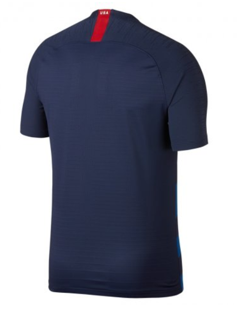
Following an almost identical pattern, just reversed. The away kit ditches the red lines and opts for a blue tonal shift from dark to light. The nape does remain red in colour which gives the top a much needed character boost. The logos are each highlighted accordingly and this is a subtle, stylish kit.