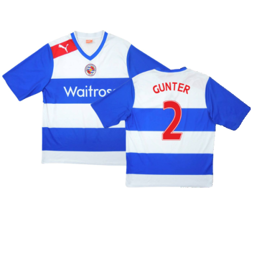
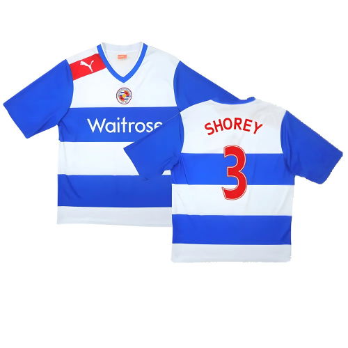
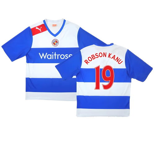
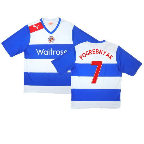
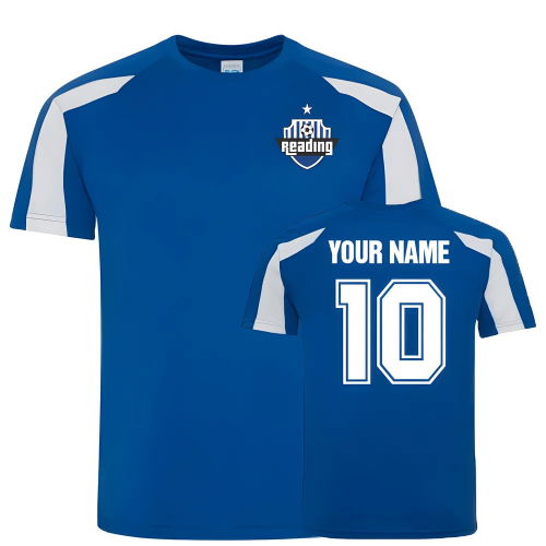
The Story of Reading’s Kits
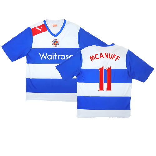
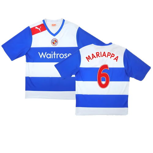
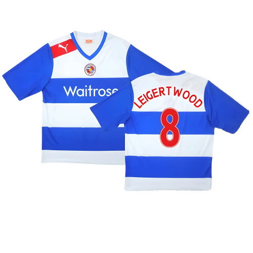
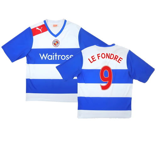
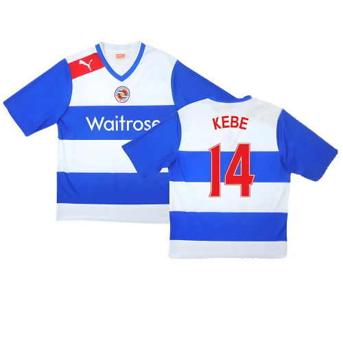
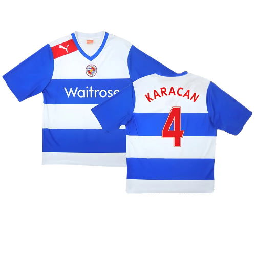
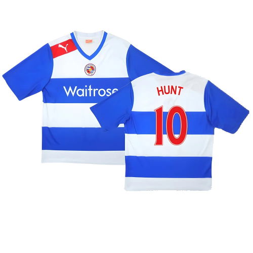
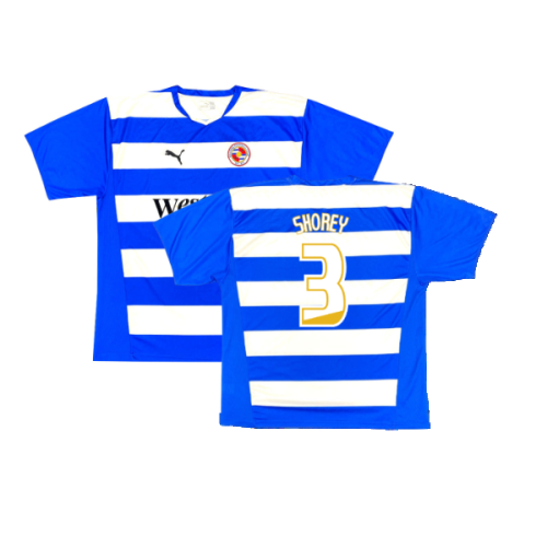
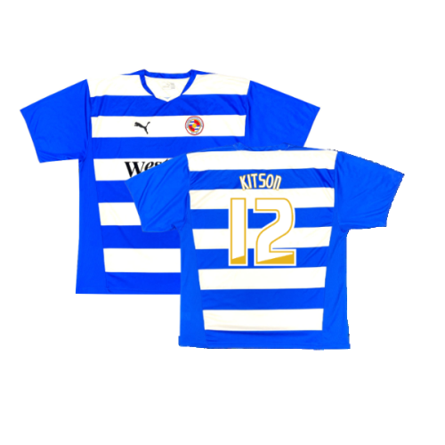
Few designs in English football are as distinctive as Reading’s blue and white hoops. First introduced in the late 19th century, the pattern has become a symbol of the club’s identity and connection to the town’s royal heritage — earning the nickname The Royals.
While other clubs have experimented heavily over time, Reading have stayed true to their hooped design, representing both consistency and community pride. The clean, bold stripes remain one of the Football League’s most recognisable looks.
Kit Evolution and Brand Heritage
Reading’s earliest shirts were dark blue with light blue trim, before the hoops were introduced permanently in 1871. Over the decades, manufacturers such as Admiral, Puma, Macron, and Erreà have all put their own spin on the classic look — experimenting with stripe width, sleeve patterns, and collar styles while maintaining the royal blue theme.
The 1980s brought brighter shades and bolder sponsors, while the 1990s and 2000s saw more fitted, modern silhouettes. Today’s kits feature advanced lightweight fabrics and subtle nods to club heritage, with gold trim or crown motifs occasionally incorporated to reflect the Royal County of Berkshire connection.
Famous Reading Shirts
-
1985/86 Home Shirt – worn during Reading’s record-breaking start to the season with 13 consecutive wins.
-
2005/06 Home Shirt – part of the club’s first-ever promotion to the Premier League under Steve Coppell.
-
2011/12 Home Shirt – remembered for another Championship-winning campaign and top-flight return.
2021/22 150th Anniversary Shirt – a gold-trimmed design celebrating a century and a half of Reading FC history.
Little-Known Facts About Reading Kits
-
The hoops weren’t always blue: Reading originally played in plain dark blue shirts before adopting the iconic hoops permanently in the late 1800s.
-
Royal inspiration: The club’s nickname, The Royals, and the use of royal blue derive from Berkshire’s royal connections and Reading’s proximity to Windsor Castle.
-
Colour variations: In the 1970s, the blue tone varied widely between seasons due to local manufacturing differences — making some retro editions notably lighter or darker than others.
-
Historic badge change: The modern crest introduced in 1998 features the town’s rivers and the club’s founding year, replacing a simpler circular badge used since the 1950s.
-
Fan-influenced kits: Supporters have voted on away shirt colours in multiple seasons — including a memorable red-and-black hooped design in the early 2000s.
-
Unique number fonts: The 2005/06 Premier League promotion shirt used a custom font based on Reading’s civic typeface — a detail missed by many collectors.
Eco-conscious production: Recent kits have been produced using recycled polyester, as the club embraces more sustainable manufacturing practices.
Our Range and Personalisation Options
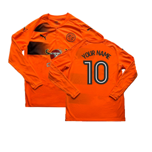
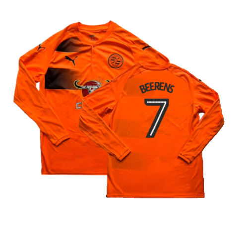
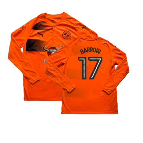
At UK Soccer Shop, you’ll find the full Reading FC collection — official home, away, and third shirts, along with retro classics and training wear. Each jersey is 100% authentic and features the official crest, manufacturer logo, and sponsor detailing.
Personalisation is available across most shirts, allowing you to add your name or that of club legends such as Kevin Doyle, Dave Kitson, or Michael Morrison.
Explore related collections to complete your setup:
Why Reading Shirts Stand Out
Reading FC’s blue and white hoops are more than a design — they’re part of the club’s DNA. Each shirt symbolises community, history, and pride, connecting past and present generations of fans. Whether you’re adding a retro classic or the latest release to your collection, a Reading shirt is the perfect expression of loyalty to the Royals.


